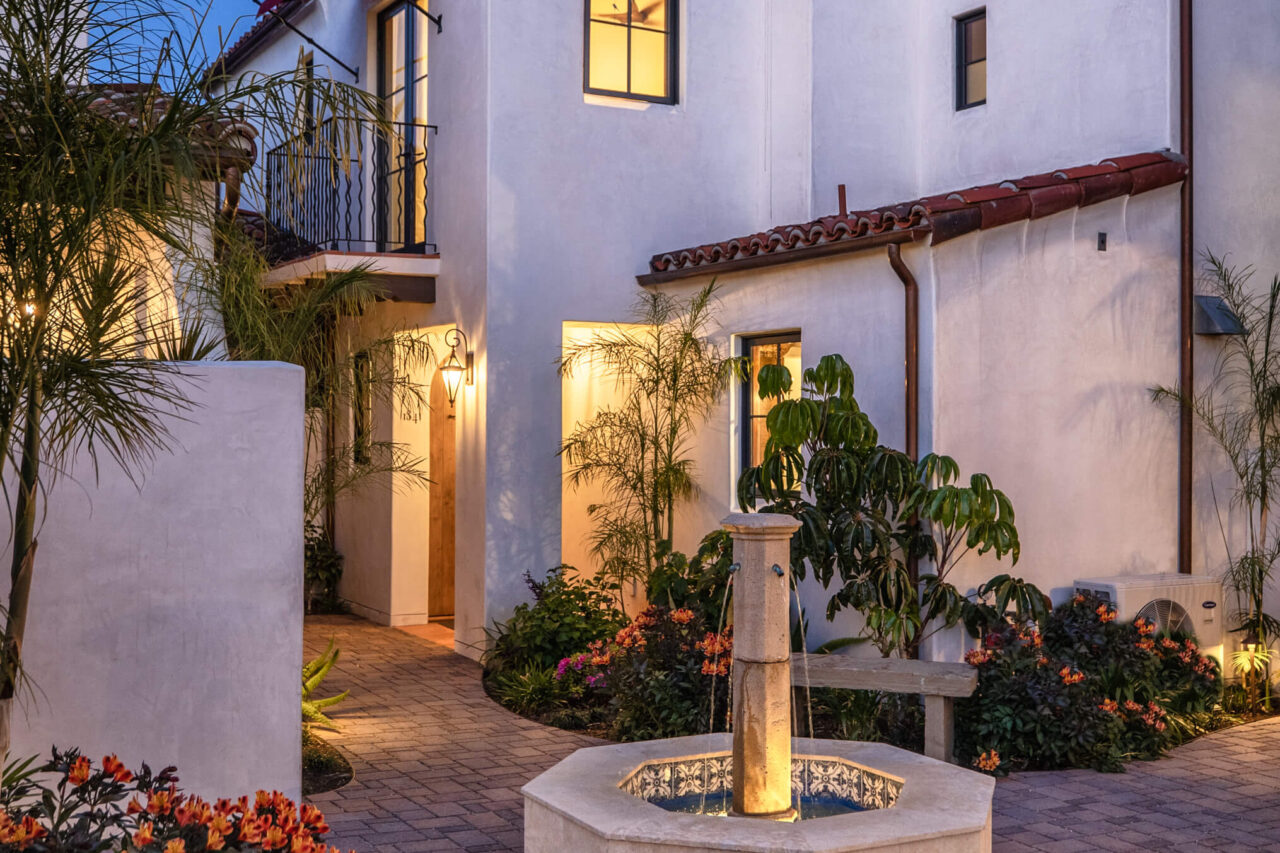
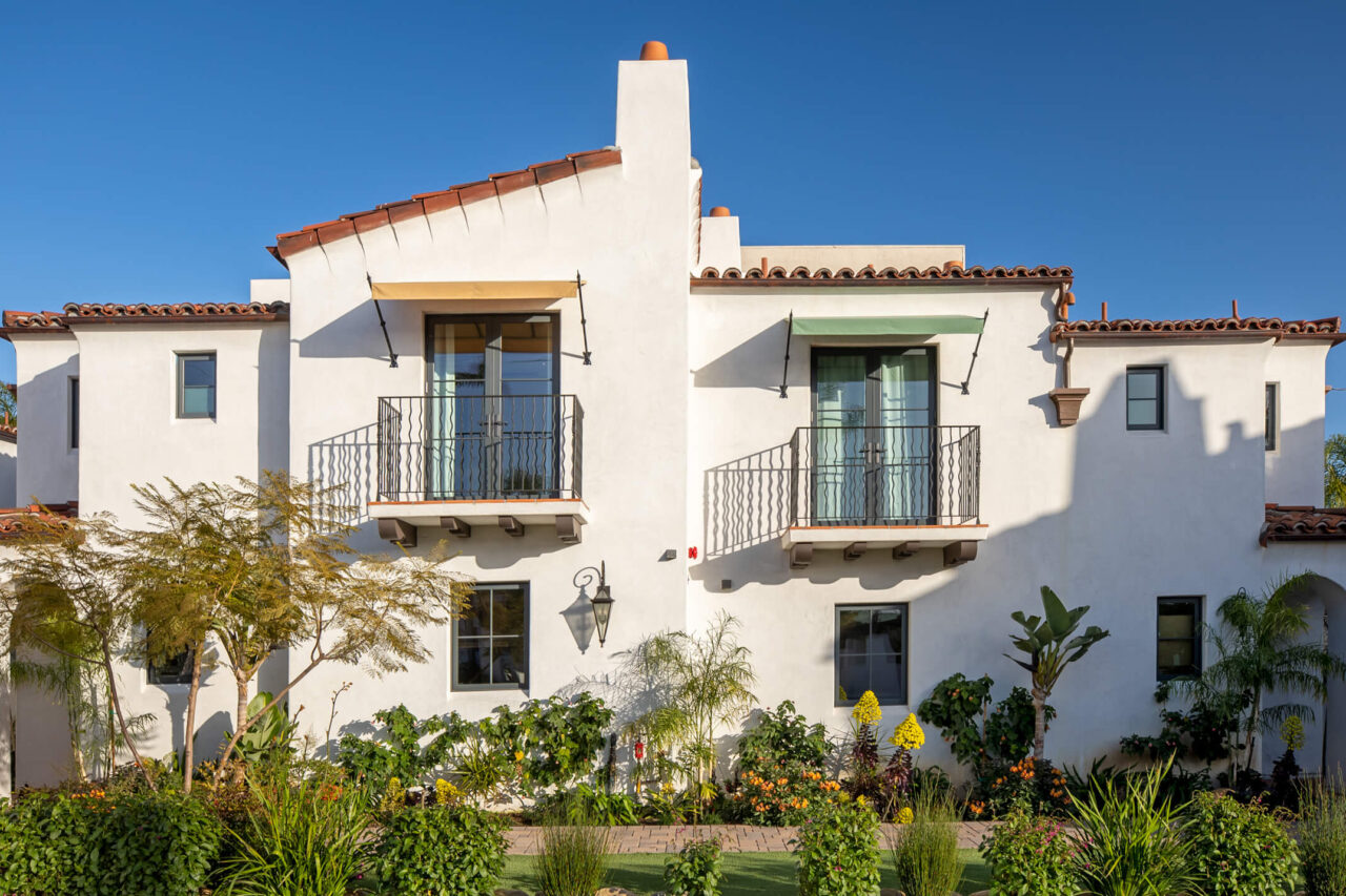
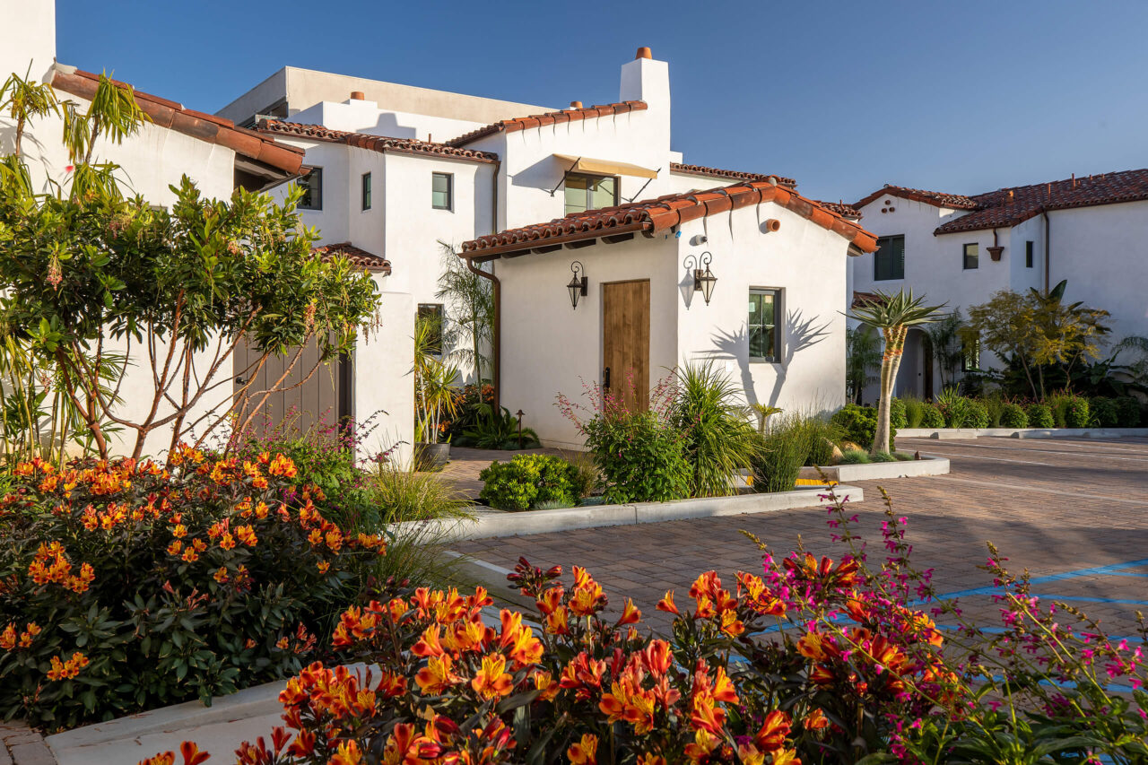
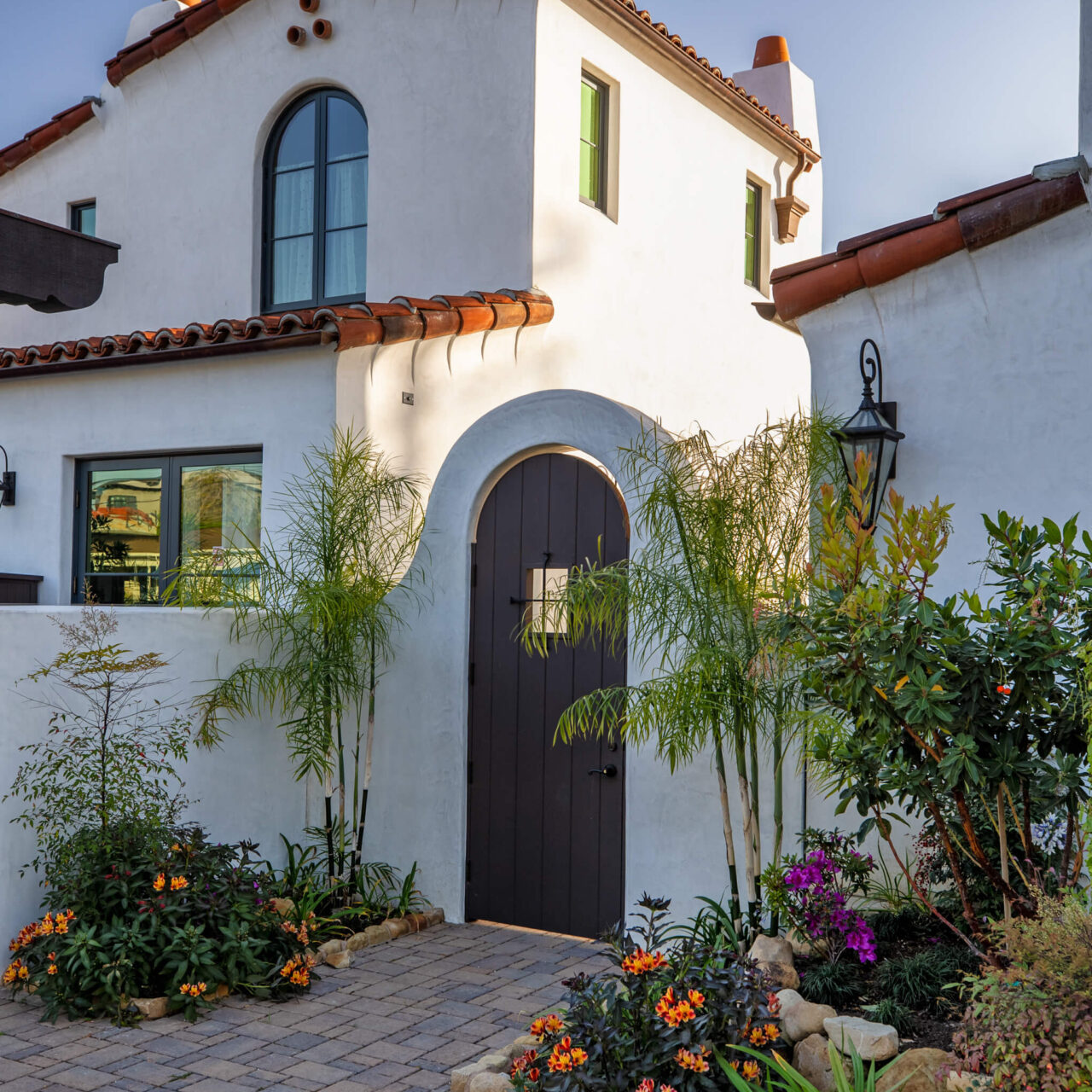
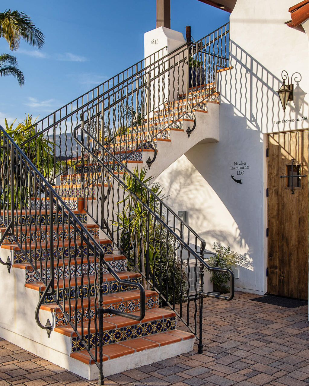
Santa Barbara is an alluring little town on the coast of Southern California, known for its large sandy beaches, the Spanish Revival architecture, and the superb landscaping.
The State and Pedregosa project is located on the first block of the El Pueblo Viejo district, an area of downtown that serves as a transition between commercial and residential neighborhoods. Close to transitways and Santa Barbara’s vibrant downtown, this project is a perfect fit for this neighborhood, combining a commercial space with residences to support the housing initiatives in Santa Barbara.
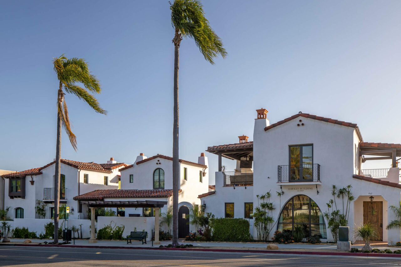
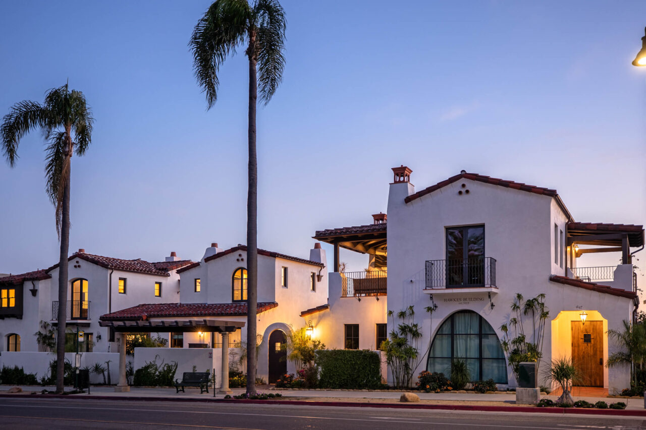
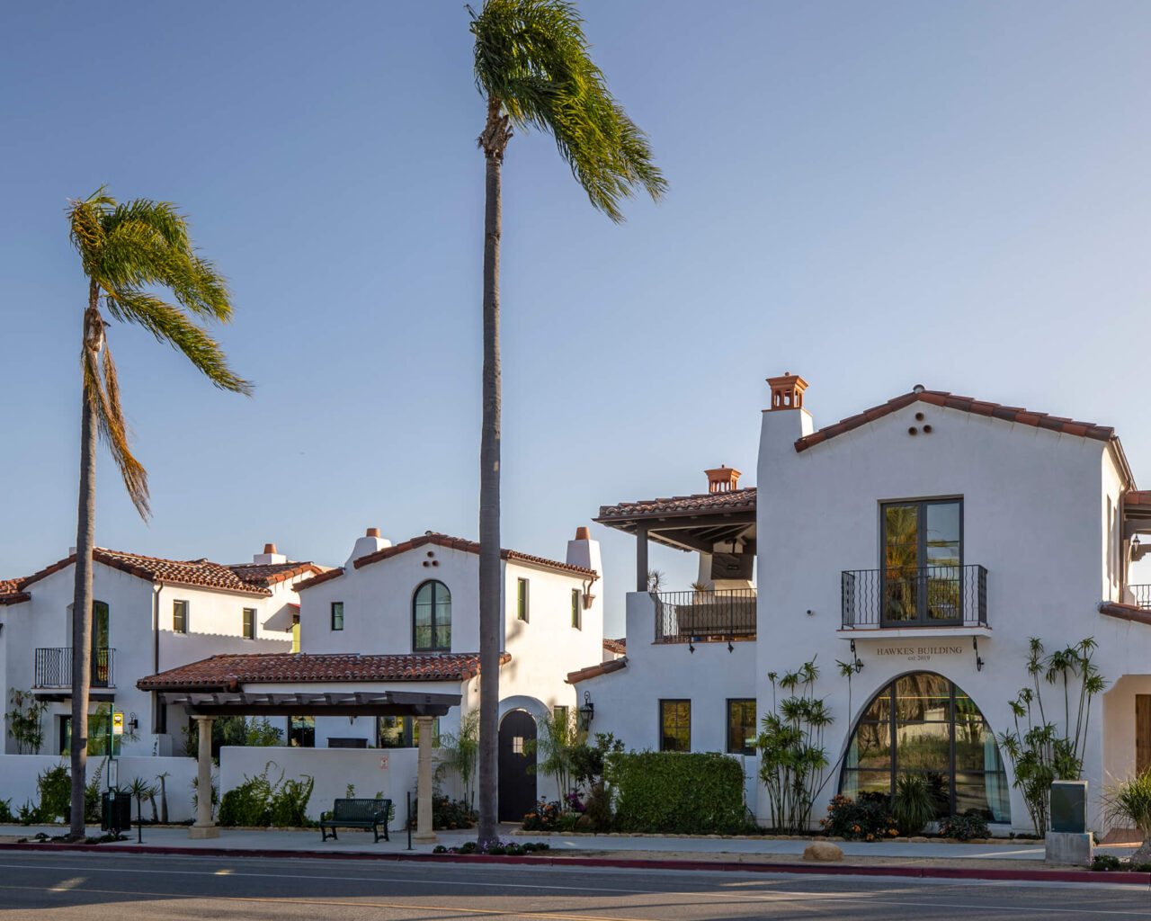
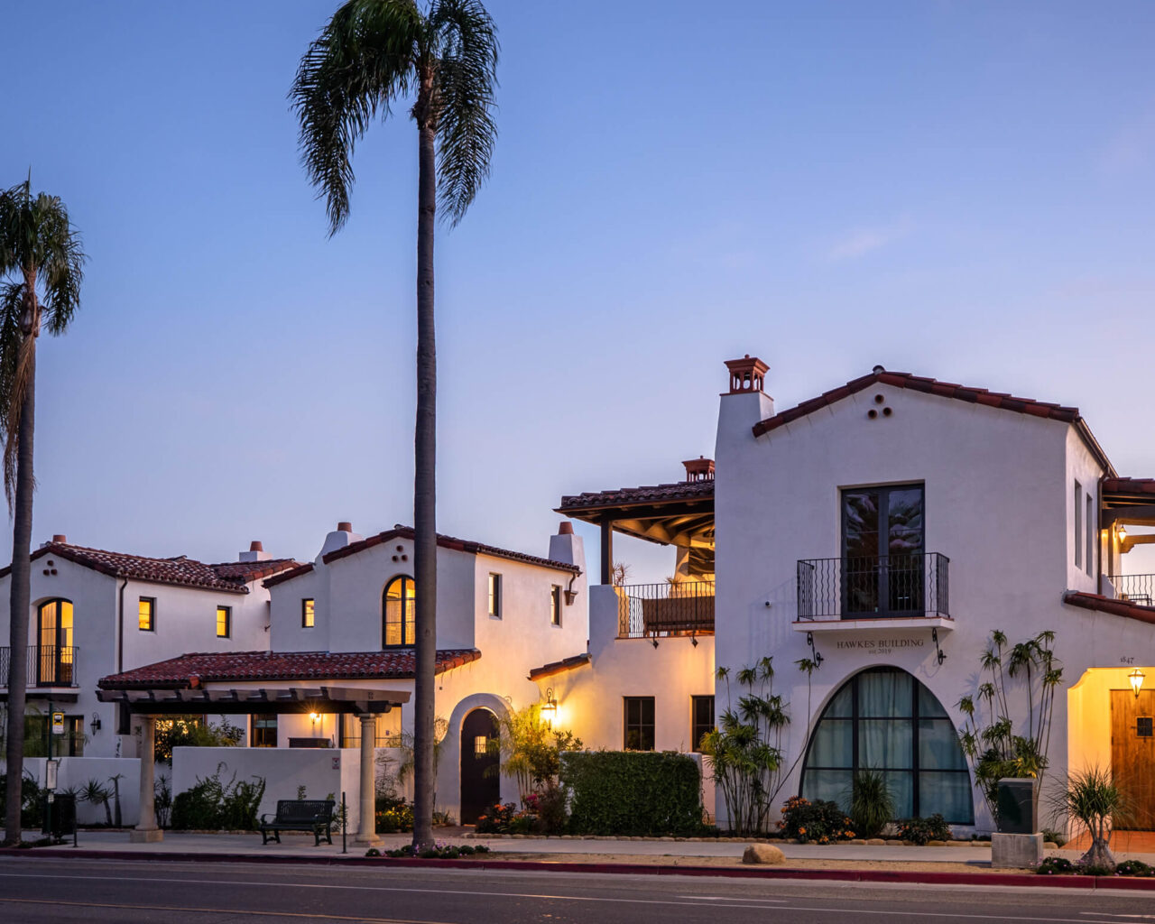
The goal was to create practical but luxurious office spaces that melded with the beautiful and desirable housing that maximised common use spaces. The commercial building includes a large statement window with a remarkable parabolic shape, as well as a balcony, which features a fireplace and deck embodying the Santa Barbara lifestyle even at work.
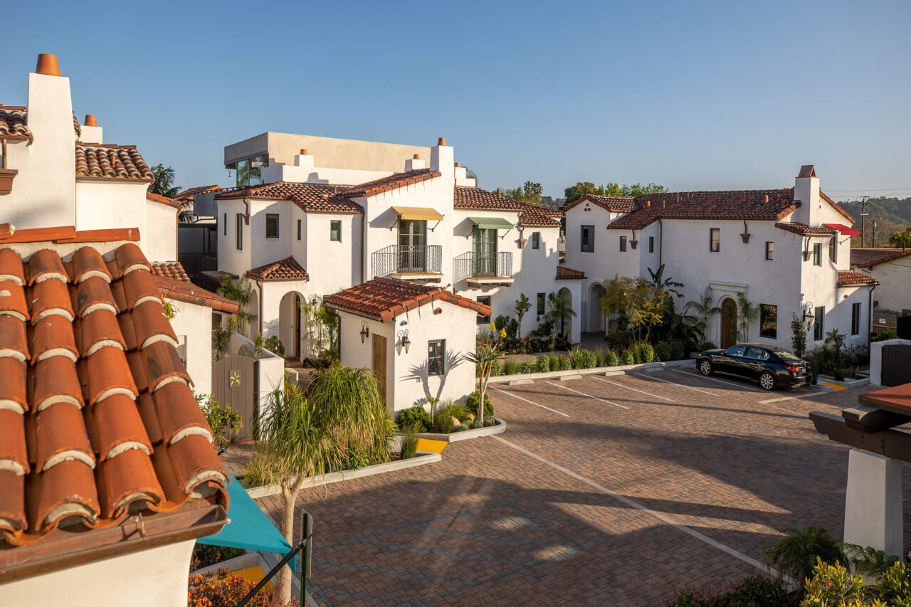
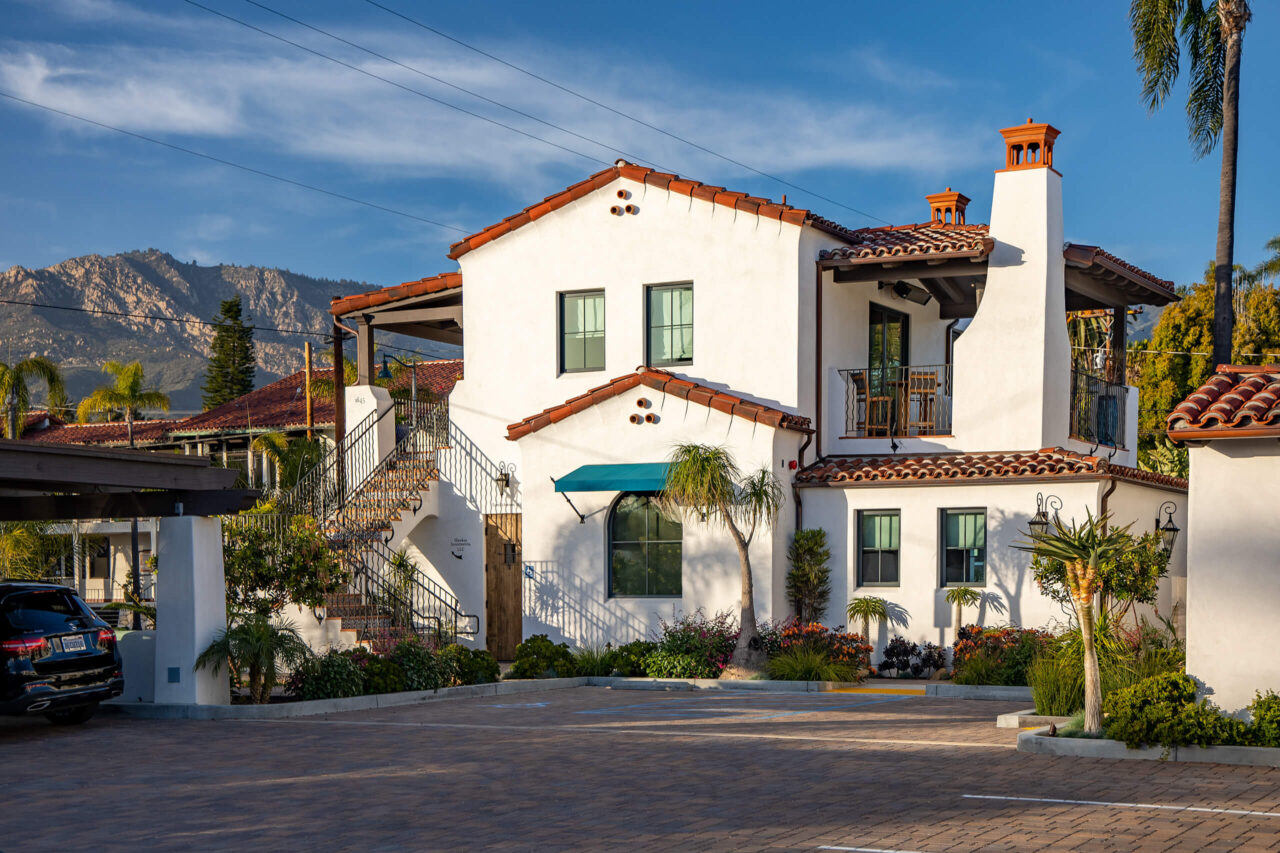
The project is made up of the picturesque commercial building and six homes in three distinct duplex houses, which are a mix of one- and two-bedrooms units. State and Pedregosa is a personal project for Tom, after completion in 2021, Thomas Ochsner Architect offices moved into the building.
With the two distinct uses of the property, it was important to make sure there was a cohesive architectural unity while still maintaining contrast. A cohesive design was a priority, and that can be seen in the details of the residential buildings. Not only is the elliptical shape of the statement window mirrored in the camber top windows and doors, but the Spanish Revival details create harmony across all the buildings as well.
“[all the buildings] utilize a simple vocabulary that is carried throughout but it’s just that the commercial [building] has a little bit more attractiveness in terms of the size and robustness of the detailing.”
One of the key drivers of the design was the housing and property use directives. The city of Santa Barbara has adopted an Average Unit-Size Density program (AUD). The overall design had to maintain the standards of the housing density program, as the location is a transitional space between commercial and residential neighborhoods.
The AUD standards promote additional higher density residential housing near transitways for public transport and near commercial services. It also allowed for the residential buildings to be higher density duplexes instead of a single monolithic building. This made it possible to have more private spaces where the residents could take advantage of the outdoors and the landscaping while still maintaining privacy.
Creative landscaping was especially important to take advantage of the small exterior private spaces and unite them with the interior space as much as possible. The landscape design uses a diversity of plants to compliment the climate and the spaces, making sure to include combinations of tall and lush plants so that even over the tall privacy fencing the residents can still enjoy the greenery and the outdoors.
Tom also spoke to overcoming the landscape challenges, “The landscaping becomes a very critical item in terms of how-do-you maximize its impact in such a small area. So, we put a lot of thought into how a little bit of landscaping can go a bigger way“
When you are dealing with an AUD program one of the things they reduce is parking but they also reduce the amount of open space and private open space.
In speaking to Loewen’s unique fenestration products “The diversity that Loewen has got has made it easy to account for the various unique openings around the various buildings.”
Another key to merging the outdoor and indoor spaces successfully was the use of large openings with BiFold sliding doors and French patio doors.
The camber top French casement windows create an authentic look and the wide openings uninterrupted sight lines and ample natural light.
“…We tried to take advantage of the small exterior private spaces and unite them with the interior space as much as possible and that’s been done by some of the big operating units from Loewen.”
“In terms of appeal I like casement windows. It’s in the historic district so it needs to look historic with wood profiles; the heavier profiles are more traditional here. The casements I like them, easier to operate, more opening both physically and for light. I like the casement [push-out] operations from Loewen very well.”
“While keeping the traditional look, the fenestration products meet all modern performance requirements.”
The glass units also are STC glass – sound transmission class (control) to quiet any road noise, as well as U-value rated to achieve thermal, solar heat gain and UV control standards to meet state and local codes. The feature window on the commercial building is a Parabolic/elliptical large window.
Both commercial and residential spaces used a variety of exterior clad luxury wood window and door products. The look and feel of wood windows fit perfectly with the architectural cues in the neighborhood.
“Feature point of the commercial building of course was the parabolic window and the way the mullions were drawn up in the details were matched exactly by that custom unit, the elliptical shape which is not an easy shape to do was right on. There are some examples in town where you can see where it wasn’t done right. But I am proud of how that turned out and I think [Loewen Windows] should be too.”
All fenestration products are metal-clad exteriors with all wood interiors. The glazing includes sealed units with applied simulated divided lites and grilles between the glass. All glass is dual pane LowE coated for superior U-values, and SHGC performance. The robust wood design and sealed unit design contribute to superior sound transmission reduction.
The look of the windows’ designs reflects the historic architecture of Santa Barbara. Many of the feature windows are custom camber top French casement windows where both sides open for impressive maximum opening to the outside.
The window selections feature primarily push out casements, an elegant and traditional operation. The minimal pushout sash, compared to the crank sash, also increases the glass viewing area. Direct Set fixed windows were created both in traditional square and camber top styles. To add to the variety of solutions, traditional double hung windows were used to overcome specific space and ventilation requirements.
On the balconies, patios, and entranceways a variety of swinging and sliding doors were chosen. The variety of options contributes the individuality of the housing units. All the doors feature grille bars for the authentic and historic look desired by the location and by the architectural design.
A selection of swinging terrace doors in traditional square and custom camber top were specified. These are primarily French doors that feature doors panels with both doors able to open. The bi-parting MultiSlide doors are pocketed to disappear into the walls; four panel bi-fold doors, with accordion opening panels, stack to sides for larger openings help to bring the feeling of outdoors to the indoor spaces.
